Toward a digimob logo
Page 2 of 3 •  1, 2, 3
 ![]()
Re: Toward a digimob logo
![]() Sascrunch Thu Aug 13, 2009 2:02 pm
Sascrunch Thu Aug 13, 2009 2:02 pm

Sascrunch- Location : Colorado
Number of posts : 40
Registration date : 2008-08-12
Re: Toward a digimob logo
![]() ankh_f_n_khonsu Thu Aug 13, 2009 5:54 pm
ankh_f_n_khonsu Thu Aug 13, 2009 5:54 pm
ankh_f_n_khonsu- Number of posts : 545
Registration date : 2008-09-15
Re: Toward a digimob logo
![]() ezavan Thu Aug 13, 2009 8:57 pm
ezavan Thu Aug 13, 2009 8:57 pm

ezavan- Age : 37
Location : middle of nowhere
Number of posts : 113
Registration date : 2009-06-08
Re: Toward a digimob logo
![]() neutralrobotboy Fri Aug 14, 2009 3:19 am
neutralrobotboy Fri Aug 14, 2009 3:19 am
Can you be more precise when you say it "gives you a portal"?I've been thinking about this a little more... Forumotion gives us a portal, but it's currently disabled. We could easily use this - or another logo - there, or we could consider a site revamp. Comments? Suggestions?
i like the mountain idea, but instead of generic radio waves, i think the emanation should be a symbol of sigil caliber.
I agree that the mountain/broadcast idea could be improved. What I like about the mountain idea is mostly that it represents the "from us to you" aspect of the work. Actually, I think the hexagram, the mountain/broadcast image, the "seed" from the current banner (well, from BOTA), and perhaps some of the numbers mentioned earlier in the thread, point to a process that could form the basis for a powerful aspect of a new symbol: The transformation of the microcosm by the macrocosm and vice-versa. That is, the mutual transformation or what might be considered the "transformation cycle", wherein external circumstances bring about conditions suitable for interior change which, when complete and established, reflect outwardly to change external circumstances for others.
I've been slack with actually doing concrete work on this, I'll try to rectify that very soon. For me, though, this is the most interesting and pertinent idea to represent.
An "our will is" statement that extends what's already been proposed might be: "Our will is that knowledge be distributed freely, so that others may get what they need in order to alter themselves, so that the transformation cycle may quicken its pace and enlarge its scope."
neutralrobotboy- Age : 42
Number of posts : 255
Registration date : 2008-12-23 -

Re: Toward a digimob logo
![]() Khephra Fri Aug 14, 2009 9:14 am
Khephra Fri Aug 14, 2009 9:14 am
What do you think, Ezavan?
Khephra- Age : 59
Number of posts : 897
Registration date : 2008-08-10
Re: Toward a digimob logo
![]() neutralrobotboy Sun Aug 16, 2009 1:07 am
neutralrobotboy Sun Aug 16, 2009 1:07 am
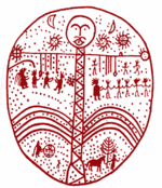
The mountain/broadcast design has been morphed into a triangle/broadcast design that I thought was more suitable for the overall logo. Other features:
- The idea of the "seed" described earlier has been used with the triangle design as well, with one triangle encapsulated in a larger one, and projecting outward into it.
- The small triangle contains the I Ching hexagram for "Inner Truth", as described earlier.
- The rays projecting outward from the pinnacle of the small triangle also follow the pattern of hexagram 61.
- The small triangle also contains the binary octal value 101, which is equals 5 (the pentagram/microcosm). These values also connect to the hexagram in that the yang and yin are grouped into yang-yang yin-yin yang-yang, or 1-1 0-0 1-1 in binary.
- Digimob below is written to suggest another triangle, but also the i's and o were taken to signify binary values, and drawn darker for that reason. Read from left to right, they yield 110, which is the number 6 (the hexagram/macrocosm).
I think the design could still be improved, but it's a pretty good representation of my line of thought. I also considered overlaying the lightning pattern made from following the Qabalistic Tree of Life onto this image. An interesting thing about this is that the apex of the small triangle would naturally map to Tiphareth, which means that the pinnacle of the large triangle would be Binah -- Understanding, which I think seems appropriate for digimob. Kether and Chokmah would suggest themselves above the larger triangle. Perhaps "digimob" then should be written in the empty space at the top of the large triangle. Incorporating this into the design would probably make "digimob" more prominent.
I should also note that as it is, 5 triangles are drawn or suggested:
- The large triangle
- The small triangle drawn within the large triangle
- The triangle suggested by the geometry of the rays emitted from the small triangle
- The triangle suggested by #3 in combination with the geometry of the peak of the large triangle
- The triangle suggested by the styling of "digimob" below
5 again suggesting the microcosm. Adding the Tree of Life as mentioned above would change this to 6 triangles (including the one suggested by tracing from Kether to Chokmah), unless "digimob" were written at the top of the big triangle, as mentioned above. Whether the number of equilateral triangles in the logo is 5 or 6 is a decision that shouldn't be taken lightly.
That's all I got for now. Comments, please!
neutralrobotboy- Age : 42
Number of posts : 255
Registration date : 2008-12-23 -
Re: Toward a digimob logo
![]() emperorzombie Sun Aug 16, 2009 8:26 am
emperorzombie Sun Aug 16, 2009 8:26 am

emperorzombie- Location : ohio
Number of posts : 56
Registration date : 2009-07-17


amandachen- Admin
- Location : Not an admin, so quit pestering me
Number of posts : 291
Registration date : 2008-08-15
Re: Toward a digimob logo
![]() Khephra Mon Aug 17, 2009 6:20 pm
Khephra Mon Aug 17, 2009 6:20 pm
neutralrobotboy wrote:Can you be more precise when you say it "gives you a portal"?
It's currently disabled, but the portal page is basically a 'home page'. Here's Forumotion's description.
Khephra- Age : 59
Number of posts : 897
Registration date : 2008-08-10
Re: Toward a digimob logo
![]() Khephra Mon Aug 17, 2009 6:23 pm
Khephra Mon Aug 17, 2009 6:23 pm
neutralrobotboy wrote:Here's a rough sketch of another proposal for the logo:
Excellent work! There are so many archetypes and characteristics that could be drawn into a logo, and I'm glad to see it generating a healthy discussion.
Khephra- Age : 59
Number of posts : 897
Registration date : 2008-08-10
Re: Toward a digimob logo
![]() Khephra Fri Sep 11, 2009 9:10 am
Khephra Fri Sep 11, 2009 9:10 am
Khephra- Age : 59
Number of posts : 897
Registration date : 2008-08-10
Re: Toward a digimob logo
![]() Aker Fri Sep 11, 2009 10:38 am
Aker Fri Sep 11, 2009 10:38 am
Some thoughts that are coming to mind right now, are, an imagery with a person or people, whatever, investigating, in the night or in the dark, or in an alley, or in the threshold, scanning, walking, exploring, ex-changing, investigating, being chased, in disguise, underground information, books, rare or forbidden books/manuscripts from private collections, revealing it to the world etc etc,
Hey just a few thoughts, don't curse me already !!!
Aker- Number of posts : 11
Registration date : 2009-04-29
ankh_f_n_khonsu- Number of posts : 545
Registration date : 2008-09-15
Re: Toward a digimob logo
![]() Aker Wed Sep 16, 2009 8:31 am
Aker Wed Sep 16, 2009 8:31 am
Aker- Number of posts : 11
Registration date : 2009-04-29
Re: Toward a digimob logo
![]() Khephra Sat Oct 10, 2009 11:14 am
Khephra Sat Oct 10, 2009 11:14 am

Khephra- Age : 59
Number of posts : 897
Registration date : 2008-08-10
Re: Toward a digimob logo
![]() ezavan Sat Oct 10, 2009 1:43 pm
ezavan Sat Oct 10, 2009 1:43 pm
ezavan- Age : 37
Location : middle of nowhere
Number of posts : 113
Registration date : 2009-06-08
Re: Toward a digimob logo
![]() neutralrobotboy Mon Oct 12, 2009 7:21 pm
neutralrobotboy Mon Oct 12, 2009 7:21 pm
neutralrobotboy- Age : 42
Number of posts : 255
Registration date : 2008-12-23 -
Re: Toward a digimob logo
![]() Hadrianswall Sat Oct 17, 2009 4:42 am
Hadrianswall Sat Oct 17, 2009 4:42 am

Hadrianswall- Number of posts : 209
Registration date : 2008-09-01
Re: Toward a digimob logo
![]() Khephra Sat Oct 17, 2009 11:18 am
Khephra Sat Oct 17, 2009 11:18 am
Hadrianswall wrote:a variation, for sites where a border would help:
Wow! I like that one too! Maybe we can send affiliates both and let them choose which one they'd like?
Khephra- Age : 59
Number of posts : 897
Registration date : 2008-08-10
Re: Toward a digimob logo
![]() ezavan Sat Oct 17, 2009 1:27 pm
ezavan Sat Oct 17, 2009 1:27 pm
ezavan- Age : 37
Location : middle of nowhere
Number of posts : 113
Registration date : 2009-06-08
Re: Toward a digimob logo
![]() amandachen Sat Oct 17, 2009 5:01 pm
amandachen Sat Oct 17, 2009 5:01 pm
??ezavan wrote:suggestive of an egg, which i think is appropriate to our ends.
Cock-a-doodle-doo!
amandachen- Admin
- Location : Not an admin, so quit pestering me
Number of posts : 291
Registration date : 2008-08-15
Re: Toward a digimob logo
![]() ezavan Sat Oct 17, 2009 5:11 pm
ezavan Sat Oct 17, 2009 5:11 pm
ezavan- Age : 37
Location : middle of nowhere
Number of posts : 113
Registration date : 2009-06-08
Re: Toward a digimob logo
![]() neutralrobotboy Sat Oct 17, 2009 7:45 pm
neutralrobotboy Sat Oct 17, 2009 7:45 pm
yes, no, anybody feel me on that?
I'm with ya. I agree, it looks like an improvement to me.
neutralrobotboy- Age : 42
Number of posts : 255
Registration date : 2008-12-23 -
Re: Toward a digimob logo
![]() The_One_True_Fred Fri Oct 30, 2009 2:59 am
The_One_True_Fred Fri Oct 30, 2009 2:59 am
The_One_True_Fred- Age : 38
Number of posts : 17
Registration date : 2008-09-14
Re: Toward a digimob logo
![]() Khephra Fri Oct 30, 2009 3:38 pm
Khephra Fri Oct 30, 2009 3:38 pm
The_One_True_Fred wrote:Does the hermit from the current banner come from any specific tarot deck? Maybe one composed of hermetic gnomes?
How'd you guess?
Khephra- Age : 59
Number of posts : 897
Registration date : 2008-08-10
Page 2 of 3 • 1, 2, 3 ![]()